CEGEDIM RX
BRAND IDENTITY

Hello

Welcome to our guidelines

On this site, you'll find high-level guidelines, examples and assets we use the most. Just need the logo? That's fine we have that too. See below for fonts, colours and example usage.
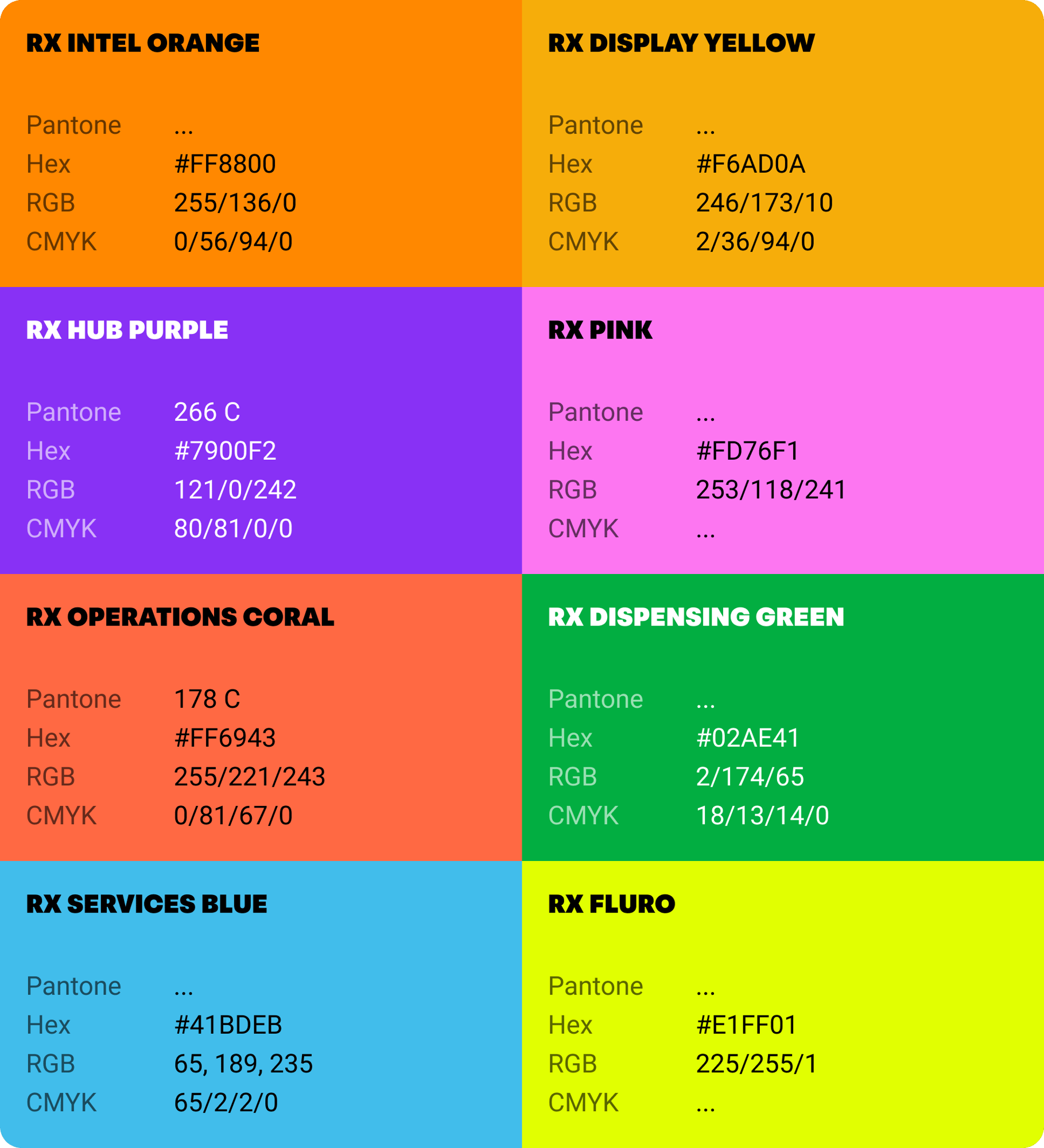
Colours

Our colour palette is fun and vibrant whilst retaining it’s roots in healthcare through it's use of blues. When we apply our refreshed brand to our marketing assets, there’s a sense of fun and playfulness that helps us stand out in the healthcare space. 

Foundations

The combination of our foundational colours act as the backbone for our visual language. The blue signifies trust, intelligence, and calm confidence.

Foundational colours

Accents

We can combine the foundational colour palette with energetic accent colours to create exciting colour combinations.

accent

Examples

The new colours give us lots of scope for different combinations.

Resources

Logos

Our logos are the core symbols of our brand identity.

They combine simplicity, clarity, and confidence to ensure strong recognition across all applications.

Cegedim Rx

Full Colour

Our logo is only to be used in the following colourways. Please don’t use our logo in any other colour combinations.

CRX Logo

White

A white version for use on dark backgrounds.

Cegedim Rx White

Clearspace

This diagram shows the formula for creating the minimum margin of space around our logo.

minimum spacing-1

Products

Product Logos

Tone of Voice

Lorem ipsum dolor sit amet, consectetur adipiscing elit, sed do eiusmod tempor incididunt ut labore et dolore magna aliqua.

Typography

We use three typefaces in our branding, each serving a specific role for clarity and hierarchy.

Important: Headings (Peridot) should always be uppercase with tight line-height in order to create impact.

Headings & Titles

Peridot PE Variable | Condensed Heavy

Major statements and headlines, or when you want to draw attention to something.

headers

Bodycopy

Gelica | Light | Regular | Med | Bold

Paragraphs • Product descriptions •  Long-form content • Regular and Medium weights

Body

Accents

Run Wild

Run Wild is our ‘annotation’ typeface, used to bring a personal flourish for the more expressive moments. It should ideally always be coloured black unless a unique circumstance is required.

Tip: Use with arrows to create a hand annotated effect. 

Accent

Highlights

When drawing attention to a piece of copy, apply a bright 'highlight' strip behind the text to create a fun highlighter effect. 

Try to maximise legibility by keeping the contrast between the copy and the colour high.

Important: Highlights should have sharp edges with no radius on the corners. 

highlights

Examples

Here’s a range of examples that show how our brand typography can work together.

Brand Video

Video needs updating to include more Peridot typeface...

Change with confidence

Art Direction

Our visuals are confident, contemporary, and intentionally crafted—using strong composition, expressive colour, and distinctive imagery to create impact.

Every element adds character while maintaining clarity, credibility, and trust.

Illustration

Illustration helps when it comes to expressing an idea or an abstract concept. To double down on the ‘be more human’ approach the illustrations have a hand made mixed media quality to them.

Icons8.com

Iconography

icons

Stickers

Use stickers to amplify, not distract. They add emphasis, emotion, and brand personality when used with restraint. Keep placement intentional, styles consistent, and messaging clear.

stickers

Arrows

arrows-1

Resources

Production

All presentations should be created in Canva to ensure brand consistency and efficient version control.

Canva

Canva enables teams to access approved templates, maintain visual standards, and easily share or edit presentations in one centralised platform.

Take me to Canva!

Canva@2x